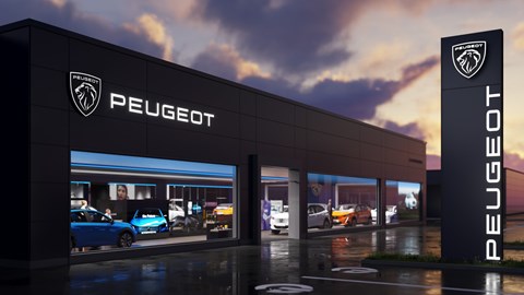
► Peugeot undergoes a comprehensive rebrand for 2021
► New lion's-head badge to debut on 308
► Tom Wiltshire has some thoughts
The future’s been laid down, and Peugeot’s entering the next chapter of its life with a comprehensive rebrand. This includes a new badge – a two-dimensional reimagining of the classic lion, directly harking back to the past as a modern version of the brand’s logo from the 1960s.
It’s similar to the one we first saw on 2018’s gorgeous e-Legend concept, and it’ll first see production on the next-generation 308 hatch, due to be unveiled later this year.
Peugeot’s undergone quite the renaissance of late. After a severely dodgy period starting in the 2000s, it perked up in the 2010s, starting with the above-average 208 and 308 Mk2 but really getting into its stride with the brilliant 3008 SUV in 2016.
Five years on, the French brand’s gone from strength to strength, sculpting its entire model range into good-looking, high-quality and genuinely very desirable cars. High praise for the company that once thought the doughy 307 an apt replacement for the brilliant 306.
And now it’s sealing that chapter of its life closed, with a fresh look soon to be applied across all of its cars, dealerships, and communication.
I won’t even try to claim non-partisanship here. Three of the seven cars I’ve owned over eight years of driving have been Peugeots – my first car was a 306, and I currently own a 605 and a 106 with every intention to expand that to include a 205, 309, 405 and 806 and complete my '90s garage of dreams.
I love the way the brand’s operated in the past, I like and appreciate every car in its current model line-up, and at times I’ve even been an apologist for some of the blobs it produced during its malaise era (the 1007 was clever and forward-thinking, damn it).
This is why I’m so genuinely sad that the rebrand has gone in the wrong direction.
The old lion wasn’t perfect, and was perhaps overdue a VW-style flattening to remove the tacky 3D chrome finish. And perfectly fine that would have been, perhaps switching out the pseudo-sci-fi corporate font for something a bit classier at the same time.
No, that’s not an imaginative take (perhaps that’s why I’m not a designer) but it would have been a safe one, retaining yet subtly updating the image that’s served the company so well over the last decade.
But with the new rebrand Peugeot’s waved goodbye to the standing lion in favour of its decapitated and rather more detailed cousin, and I think that’s a bad move.
Badges? Like flags, but chromier
A good car-manufacturer logo is like a national flag, and it ought to follow many of the same rules. These are the ones I’ve come up with, and hold every manufacturer to:
- Distinctive
- Simple enough for a child to draw from memory
- Monochromatic (or at least recognisable without colour)
- Meaningful
- Recognisable without text
The eagle-eyed will notice this excludes many otherwise fabulous badges – there’s no normal child who could draw every detail of Porsche’s shield from memory, for example, and though Ford’s blue oval may be distinctive it’s also colourful and script-heavy.
But some of the greats are very well-behaved. Take Audi, for example – it’s meaningful, it’s simple, and it’s unmistakable. I’d call it a perfect logo if I didn’t like Mercedes’ and Mitsubishi’s efforts more, and Citroën’s better still.
The old Peugeot lion did pretty well on this front – the lion may have been a little intricate, but it wasn’t going to be mistaken for any other brand in a hurry. It didn’t need text, or colour, and the symbolism was on the money – it came from 1847, when the lion’s teeth represented the sharpness and strength of the steel products the company was building at the time.
The new badge, though, breaks several of these principles. For starters, it has ‘PEUGEOT’ writ large across the top – not a good beginning. Second, the shield shape, which is desperately overused.
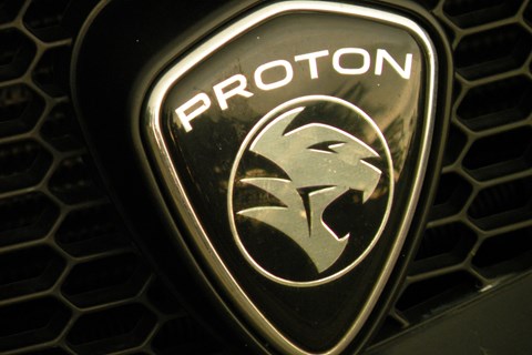
Abarth. Bristol. Buick. Dacia. Ferrari. Lamborghini. Lancia. Porsche. Proton. All of these brands either currently use, or have used in the past, a shield shape as their emblem – usually with the manufacturer name written on it.
Some go even further, with a shield, writing AND an animal involved, while poor old Proton has everything – a stylised lion, within a shield, with the name above. Plenty on Twitter made that connection before me, and dare I remark that even at its best Malaysia’s national car manufacturer doesn’t particularly project the sort of upmarket image that the Peugeot of 2021 wants to associate itself with?
New Peugeot’s all good on colour and symbolism, but falls apart once more when it comes to simplicity. Put simply, the lion head is too heavily designed and will appear too small on the cars to be noticeable from a distance. I’d be very impressed by the child who can draw it from memory, too.
I don’t really buy the historical argument, either. The lion's head alone – that this new badge apes – adorned cars from 1960 to 1970, including some all-time greats such as the 504. But the stylised, upright lion has been in place, on and off, for 56 years – and continuously since 1970.
That means the majority of people looking at a new Peugeot today will have no real memories of the old badge – and therefore no connection to the new one. Why waste the last 50 years of brand-building? If it’s to distance present-day Peugeot from its foibles in the noughties, the last decade of progress has done that already.
The real shame is that I do love the way the new logo looks – just not as a badge. If new models were to have it on the steering wheel or alloys, or embroidered onto the headrests, it would look incredible.
But in case you’re listening, newly-minted CEO Linda Jackson, the old one worked better on a bonnet.